
Creamy White

Creamy white is one of the most versatile living room colors you can choose. Unlike stark bright white, creamy white has a soft warmth that keeps the space feeling friendly and lived-in instead of clinical.
This shade brightens naturally, reflects light well, and pairs with almost any décor style—from minimalist Scandinavian to classic traditional. It also works beautifully with wood accents, woven textures, and warm metals like brass. For homeowners who want a fresh backdrop that never feels cold or flat, creamy white delivers a clean but welcoming effect.
Greige (Gray + Beige)

Greige blends the coolness of gray with the warmth of beige, creating a balanced neutral that designers love for modern living rooms. This hybrid tone adapts to both warm and cool palettes, so it works well whether your space includes light oak flooring, black fixtures, or colorful upholstery.
Because greige has subtle depth, it creates a sophisticated backdrop without overpowering the room. It also hides dirt and shadows better than pure white, making it a practical choice for busy households. Greige is ideal for transitional interiors, open floor plans, and homes that want a calm, cohesive look across multiple rooms.
Warm Taupe

Warm taupe adds a rich, earthy feel to the living room while still behaving as a neutral. It’s slightly deeper than greige and leans into natural warmth, making it a great match for rustic, cozy, or organic-inspired interiors.
Taupe pairs beautifully with materials like leather, natural stone, soft knits, rattan, and raw wood. It instantly makes the space feel grounded and inviting, especially in rooms with large windows or fireplaces. Warm taupe is an excellent choice for homeowners who want depth and character without jumping into bold or dramatic colors.
Dusty Blue

Dusty blue is a calming living room color that brings style without feeling overwhelming. Its muted tone makes it easier to live with than brighter blues, while still offering character and depth. It works beautifully with white trim, warm neutrals, and natural textures like linen or oak. This shade creates a relaxed, timeless mood—great for homeowners who want serenity with a touch of coastal or classic charm.
Sage Green

Sage green is one of the most popular nature-inspired living room colors today. Soft, muted, and earthy, sage creates a restful backdrop that feels clean and refreshing. It blends easily with modern, Scandinavian, and minimalist interiors, especially those that use light woods, black accents, or natural fibers. With indoor plants trending, sage green supports that organic aesthetic and makes the whole room feel more balanced and grounded.
Dusty Lilac

Dusty lilac offers a gentle color shift for living rooms without going too bold. It has a soft, grayed-down purple tone that adds personality while still keeping things subtle and sophisticated. This shade pairs well with warm woods, brass, and creamy neutrals. It can skew modern, romantic, or artistic depending on styling, making it a smart choice for anyone who wants quiet color rather than loud impact.
Soft Clay / Terracotta

Soft clay and terracotta tones bring warmth without feeling loud or overpowering. These earthy hues make a living room feel grounded and welcoming, especially when paired with natural wood, cream textiles, or woven accents. Terracotta also adds a Mediterranean or boho touch, making it a great choice for homes that want warmth and texture without jumping to bold reds or oranges.
Olive Green

Olive green is cozy, rich, and organic — a natural choice for living rooms that value comfort and style. Deeper than sage but still earth-based, olive adds timeless character without being dramatic. It pairs seamlessly with leather furniture, vintage rugs, warm woods, and brass finishes. If you love spaces that feel collected and calm, olive green offers depth without visual noise.
Rich Rust / Earthy Vibrancy

Rusty tones and earthy ochres are trending in interiors thanks to their ability to introduce warmth and personality. These colors draw inspiration from clay, spices, and autumn landscapes, bringing an artisanal and organic mood to living rooms. They look especially sharp with black metal accents, natural woods, and neutral sofas. Rust creates visual energy while remaining grounded and mature.
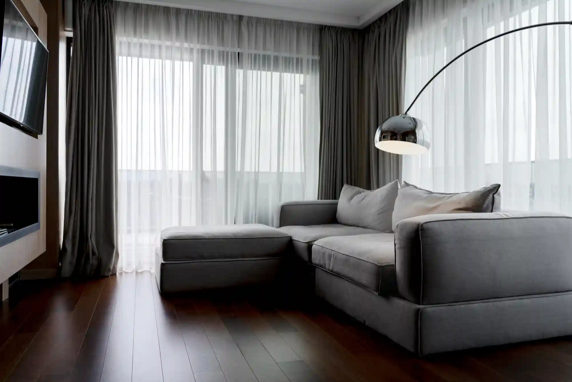
Charcoal Gray

Charcoal gray adds drama and sophistication to living rooms, especially larger spaces with good natural light. Darker neutrals like charcoal create intimacy and make lighter furniture, art, and décor pop. It works well in modern, industrial, and upscale settings, and can even replace black for a softer, more livable contrast. For bold walls without harshness, charcoal is a designer favorite.
Midnight Blue

Midnight blue is a deep, elegant blue that anchors a room and adds a refined mood. It offers richness without overwhelming the space and pairs beautifully with warm woods, brass hardware, and patterned textiles. Midnight blue works well on an accent wall or full-room application, making it a flexible choice for both minimal and maximal interiors.
Burgundy / Deep Red Tones

Burgundy and deep red tones bring personality and depth to a living room. These saturated hues feel luxurious and expressive, making them ideal for homeowners who want their space to feel curated and bold. When paired with neutral furnishings or soft lighting, burgundy can create a cozy, intimate atmosphere that feels both classic and contemporary.
Trending Color Palettes for 2026

Color trends for living rooms in 2026 lean toward warm, grounded tones that feel natural and lived-in. Nature-inspired earthy palettes—including olives, clays, siennas, and muted greens—bring comfort and a sense of calm to busy households. These colors pair well with wood, stone, and natural textures, making them easy to integrate into modern homes.
Designers are also embracing softer jewel tones and moody neutrals. Think midnight blue, stormy charcoal, dusty plum, and warm taupe. These shades offer richness without overwhelming the space and give living rooms a more curated, layered feel. The key is finding balanced combinations that feel both modern and timeless, blending bold hues with neutrals for harmony rather than contrast alone.
Tips for Choosing Your Perfect Color

Choosing the right color for your living room goes beyond liking a shade on a paint chip. A few practical steps can help you make the right call:
Test samples under your lighting conditions
Natural light changes throughout the day, and artificial light can warm or cool the color. Always paint sample swatches and observe them morning to evening.Consider furniture and décor before finalizing
Wall color should complement your sofas, rugs, curtains, and wood finishes. Even neutral palettes can clash if undertones don’t align.Use accent colors and layering for visual interest
Accent walls, textiles, and décor help give depth and personality without repainting the entire room in a bold hue.
These small steps make it much easier to land on a color that works long-term, not just in theory or on a screen.
Ready to Refresh Your Living Room Color?
Choosing the right color can transform your living room from ordinary to inviting, stylish, and uniquely yours. If you’re updating, renovating, or planning a full design makeover, we can help you choose the perfect palette based on your space, lighting, style, and budget.
Contact us today for personalized color recommendations and expert living room design guidance.
FAQs
What is the best color for a living room?
There’s no single “best” color, but warm neutrals and nature-inspired hues—like soft beige, sage green, or dusty blue—are popular because they create a calm, inviting, and stylish space that works with many décor styles.
What is the 80 20 color rule?
The 80/20 color rule is a design guideline that says 80% of your space should use one dominant color and 20% can be used for an accent or complementary shade to avoid visual overload and keep the palette balanced.
What are the living room colors for 2025?
Top living room color trends for 2025 included soft, warm, uplifting shades like Butter Yellow, Powder Blue, Dusty Pink, and Avocado green, which blend comfort with modern style.
What is the 60 30 10 rule for decorating?
The 60-30-10 color rule is a decorating formula: 60 % dominant color (often walls), 30 % secondary (furniture or larger accents), and 10 % accent color (small décor items) to create a balanced, cohesive palette.